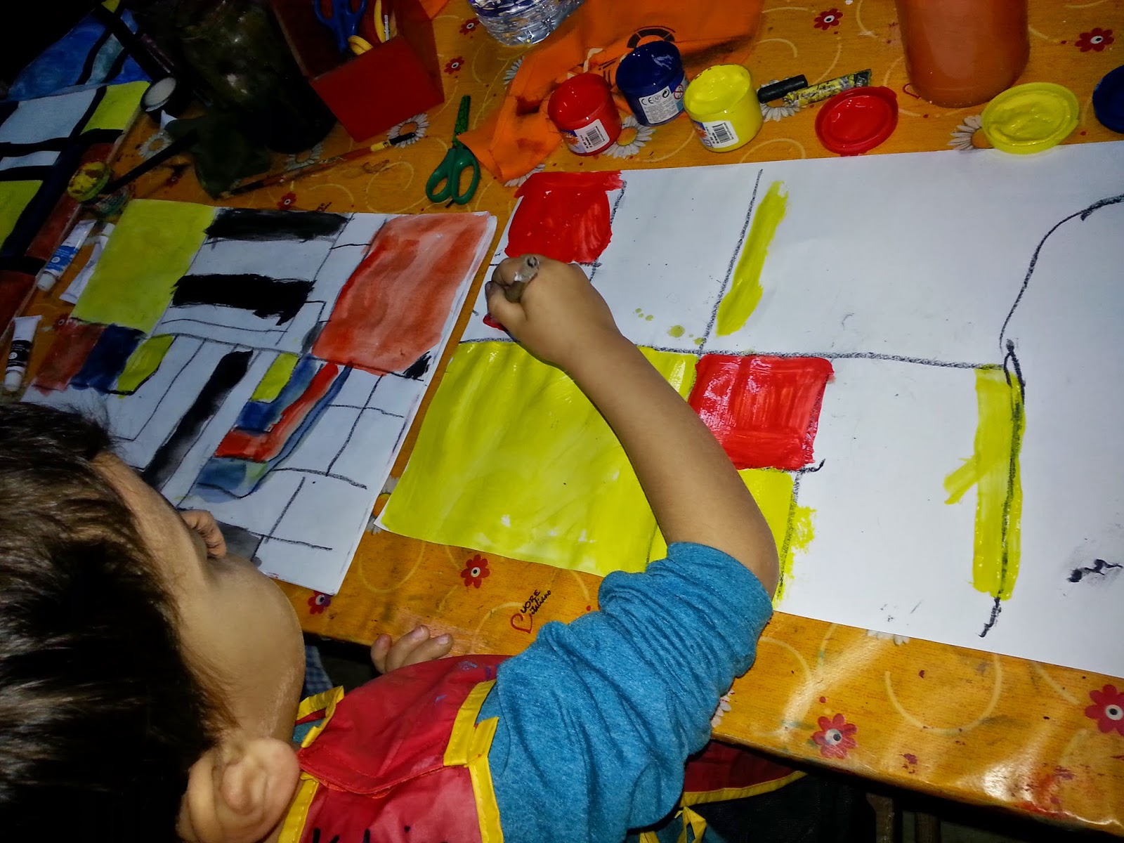
An artist who used primary colours as the foundation of his art was Piet Mondrian, born in Holland who started painting nature at first. However, upon visititn aris, he became inspired by simplicity, balance and harmony, thus striving to seek a balance between these three colours, and white and black. Mondrian referred to the yellow squares/ rectangles as 'golden section,' since the yellow literally shines when placed next to darker colours like the red, blue and black. This is called 'juxtaposition', which means in this case, the yellow is brighter when placed in juxtaposition to darker colours.
In hi paintings, one can observe balance between the colours, which are placed across the canvas in diagonal patterns or in the shape of a 'V.'
The children learned all about Mondrian and his art during the lesson, which they found quite interesting. Furthermore, they will remember the primary colours even more since they are now linked to another famous artist: Piet Mondrian.
 |
| Piet Mondrian 1872 - 1944 |
 |
| One of Mondrian's line-based paintings |


No comments:
Post a Comment