| Piet Mondrian: An Abstract Painter from The Netherlands |
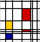
A picture in the style of Mondrian. |
Pieter Cornelis Mondriaan, Jr., (March 7, 1872-February 1, 1944) was a
Dutch abstract painter born in Amersfoort (he is usually referred to as
Piet Mondrian). He painted in a spare, precise, geometric manner mostly
using primary colors (red, blue and yellow,) whilst making use of the neutral colours (white and black.) His use of yellow was referred to as The Golden Section, which balances out the whole of the painting.
It was a style that Mondrian called neoplasticism
("nieuwe beelding" in Dutch).
Mondrian was born in Amersfoort, the Netherlands. After studying to be a
teacher, Mondrian studied art at the Rijksakademie van Beeldende
Kunsten (Amsterdam Academy of Fine Arts) from 1892 until 1897. During
this time, he painted mostly landscapes (including a series on trees).
He moved to Paris, France, around 1912. During World War 1, he moved
back to the Netherlands. In 1917, he, Theo van Doesburg, and some
others founded a very influential art magazine called "De Stijl," which
means "The Style."
In 1919, Mondrian returned to Paris, where he stayed until 1938. That
year, he moved to London, England, where he painted for two years. In
1940, he moved to New York, USA, where he spent the final four years of
his life.
Mondrian's paintings did not sell very well during his lifetime.
Mondrian had his first one-man show when he was 70 years old (two years
before he died of pneumonia); it was at the Valentin Dudensing Gallery
in New York City.
We put Mondrian's geometric style to the test whilst we kept on the same theme of owls...we also observed how we can split a square into 2 rectangles, a rectangle into 2 squares, and so on. More owls inspired by Mondrian coming soon!


