Saturday 24 January 2015

Secondary colours

Last lesson was all about the primary colours (red, blue and yellow.) Today we took this a step further and experimented what colours we can create out of these three.

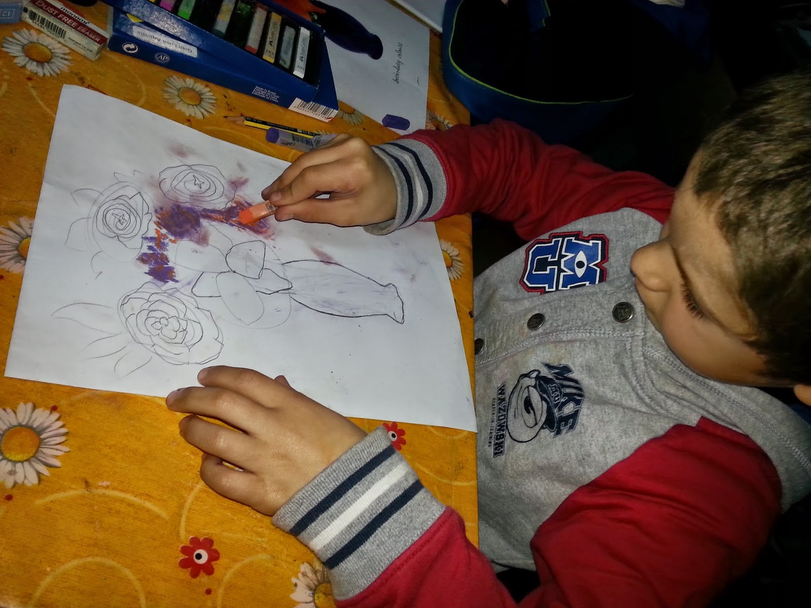
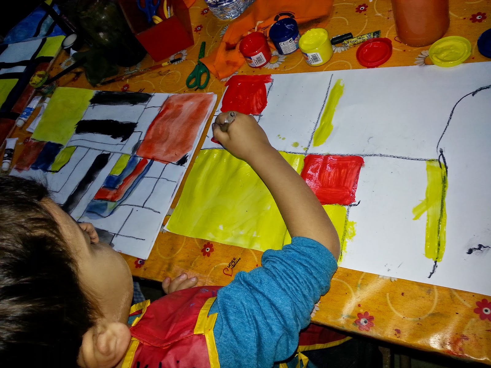
The children created their own secondary colour wheel by mixing pencil colours/ oil pastels. It is good to note that the base colour is the lighter colour since it allows the darker one to make more impact. For instance, orange= yellow+ red, therefore, yellow being lighter than red, first apply the yellow and then shade the red slowly. It is easier to darken gradually rather than lighten a darker colour.

Green= blue + yellow
Orange= red + yellow
Purple= magenta + blue. Using light blue brings a lilac colour.
Violet= red + blue (like an aubergine colour)

The children copied and drew flowers in vases by using the secondary colours, those being green, orange and purple. This was a great opportunity to learn drawing lilum, roses, fluffy sempreviva and tiny purple flowers.

A tip I gave teh childrne to draw the roses was make a circle with a spiral in it. The spiral acts as a guidance to draw the petals (in the shape of a wide 'v',) which start as small and clustered, which eventually grow in size.

The petals of the lilium were broken down into ovals/traingles/ diamonds.

These are to be continued next lesson, so stay tuned!


Saturday 10 January 2015

Piet Mondrian and the Primary Colours

The first lesson for this year was about the primary colours: red, blue and yellow, which basically, are the colours we cannot live without since all the colours emerge from these three.

An artist who used primary colours as the foundation of his art was Piet Mondrian, born in Holland who started painting nature at first. However, upon visititn aris, he became inspired by simplicity, balance and harmony, thus striving to seek a balance between these three colours, and white and black. Mondrian referred to the yellow squares/ rectangles as 'golden section,' since the yellow literally shines when placed next to darker colours like the red, blue and black. This is called 'juxtaposition', which means in this case, the yellow is brighter when placed in juxtaposition to darker colours.

In hi paintings, one can observe balance between the colours, which are placed across the canvas in diagonal patterns or in the shape of a 'V.'

The children learned all about Mondrian and his art during the lesson, which they found quite interesting. Furthermore, they will remember the primary colours even more since they are now linked to another famous artist: Piet Mondrian.
Piet Mondrian 1872 - 1944

One of Mondrian's line-based paintings