Sunday, 16 March 2014

The Groovy Owl-ish Weekend =)

The inspiration was a colourful and cute cushion from Primark... and here's what we have taken it to:

We set off designing our own owl, bursting with mismatched, yet coordinating patterns, designs and colours! Cuteness and coolness guaranteed! =) Newspaper collage and watercolour background added to the groovy and mismatched style.


More funky owls...


A twist in the subject: a Cubist-inspired portrait featuring oil pastels and watercolour on newspaper print by Ryan.


Saturday, 1 March 2014

My Flower Bed

A lovely surprise- the sweetest and prettiest flower bed I have ever seen by Ylenia! =)


Warm and Cool colours

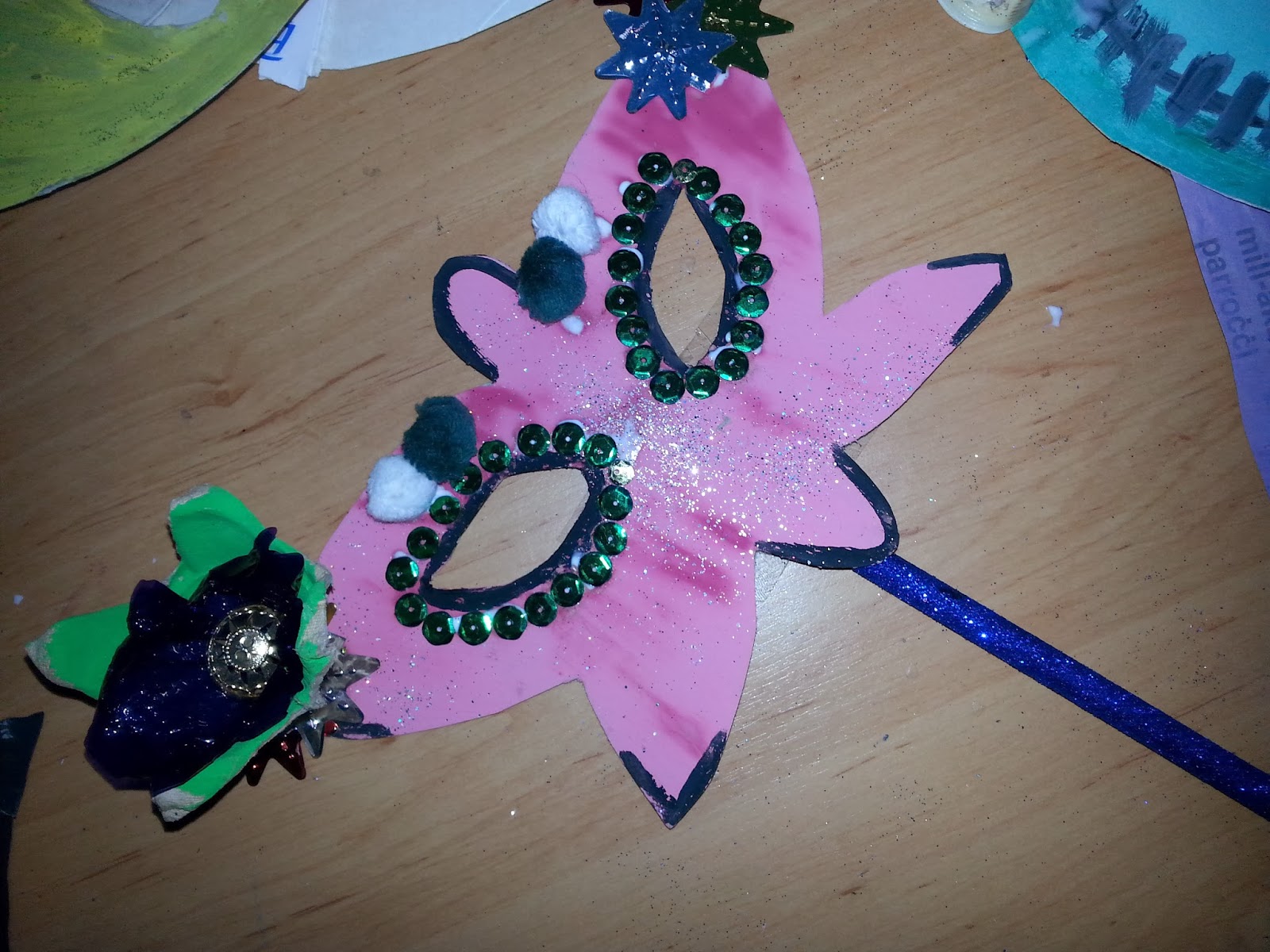
Today we drew a Carnival Mask based on the principle of Warm and Cool Colours.

Warm Colours are those colours which give us a warm and happy feeling, remind us of joyous moments, signify heat and warmth, thus sunny, clear and Summery weather. These are: reds, pinks, oranges, yellows and earth colours.

Cool colours, on the contrary, are those melancholy colours which remind us of cold and wet weather and may give sadder and tranquil emotions. These are: blues, purples and greens.

Black and white are neutral colours, therefore they can go with both warm and cool colours, mixed to create different shades on the two diverse sides.

Furthermore, we linked the colours with feelings, seasons and the weather. Therefore, on the mask is happy on the warm side, whilst weepy on the cool one.


Sunday, 16 February 2014

Carnival Masks from Re-used Material

After brainstorming and sketching on themed masks, we made us of toilet-paper rolls, corks, bottletops, egg cartons, sweet wrappers, yogurt cups and yogurt lids. Of course, a touch of glitter is all that we need!

Here is what the kids have been up to so far...you can also see some almost-finished results!


And the result is the following:

Sparkly mask-holders!


Glitzy Butterfly

Mignon from Despicable Me! =)

China Town!

A Brave Lion

Vampire Girl


Graceful Butterflies

Monster High

Beautiful Butterfly


Saturday, 8 February 2014

Others...

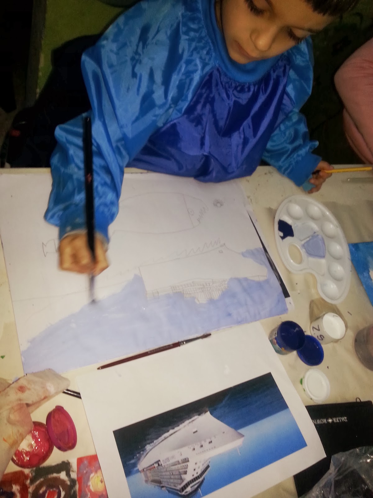
Painting Cruise liners

Water lilly in charcoal

Queen Elsa from Frozen, Mixed media on canvas

Koala Mummy Bear and her young one

Ariel

Valentine hearts and Colour tones

We learned that adding white to the colour makes it lighter, a little white, more white....

A good tip is that you put the darker colour into the lighter one on the palette, for example, red into white since white allows red to change it more. If you will put white into the red, you will need more white to mix a lighter red since red is a darker colour than white, thus more 'stubborn.'

A touch of glitter added to the sweet love =)